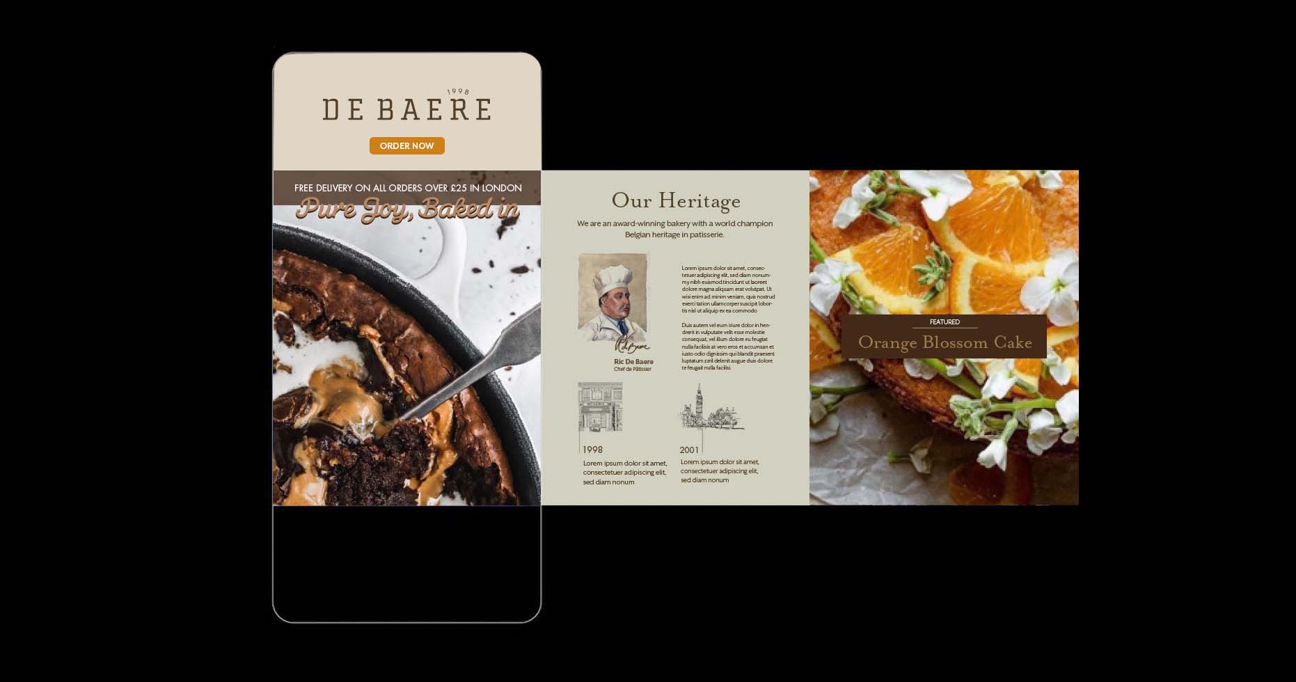
De Baere is an award-winning bakery with a strong Belgian heritage in patisserie. Established in 1998 by world champion artisan baker, Ric De Baere.
De Baere doesn’t use ‘pre-mixes’. Everything is made in the same way you would make it at home.
From their chef’s desire to create offerings that demonstrate a passion for baking, to their drivers commitment to timely deliveries… De Baere means Pure Joy Baked In. The key difference between De Baere and many other larger bakeries is that they don’t use ‘pre-mixes’, everything is made in the same way you would make it at home. Their comprehensive range of offerings are available direct to the public through their own retail kiosks, via cafés, restaurants, hotels, supermarkets, and through wholesale to catering companies and corporate clients.
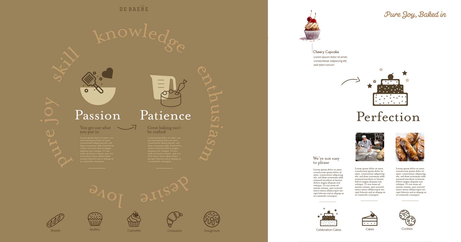
Working with our marketing agency partner, Abacus Marketing, headed up by Stephen Taylor-Brown (who led on marketing strategy), we ran a series of workshops with all of the business’s stakeholders to get under the skin of the brand, delivering key insights and strategic recommendations. We articulated a Core Proposition, “Giving nourishment and delight to every body” – signaling that De Baere go beyond baking; they’re champions of the human spirit with a desire to nurture, protect and enrich it, one mouthful at a time. People don’t just want a better croissant, they want a better moment, a better day, a better life.
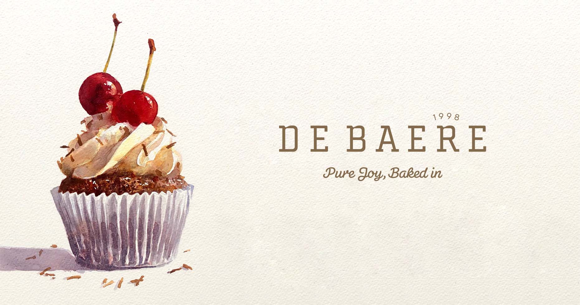
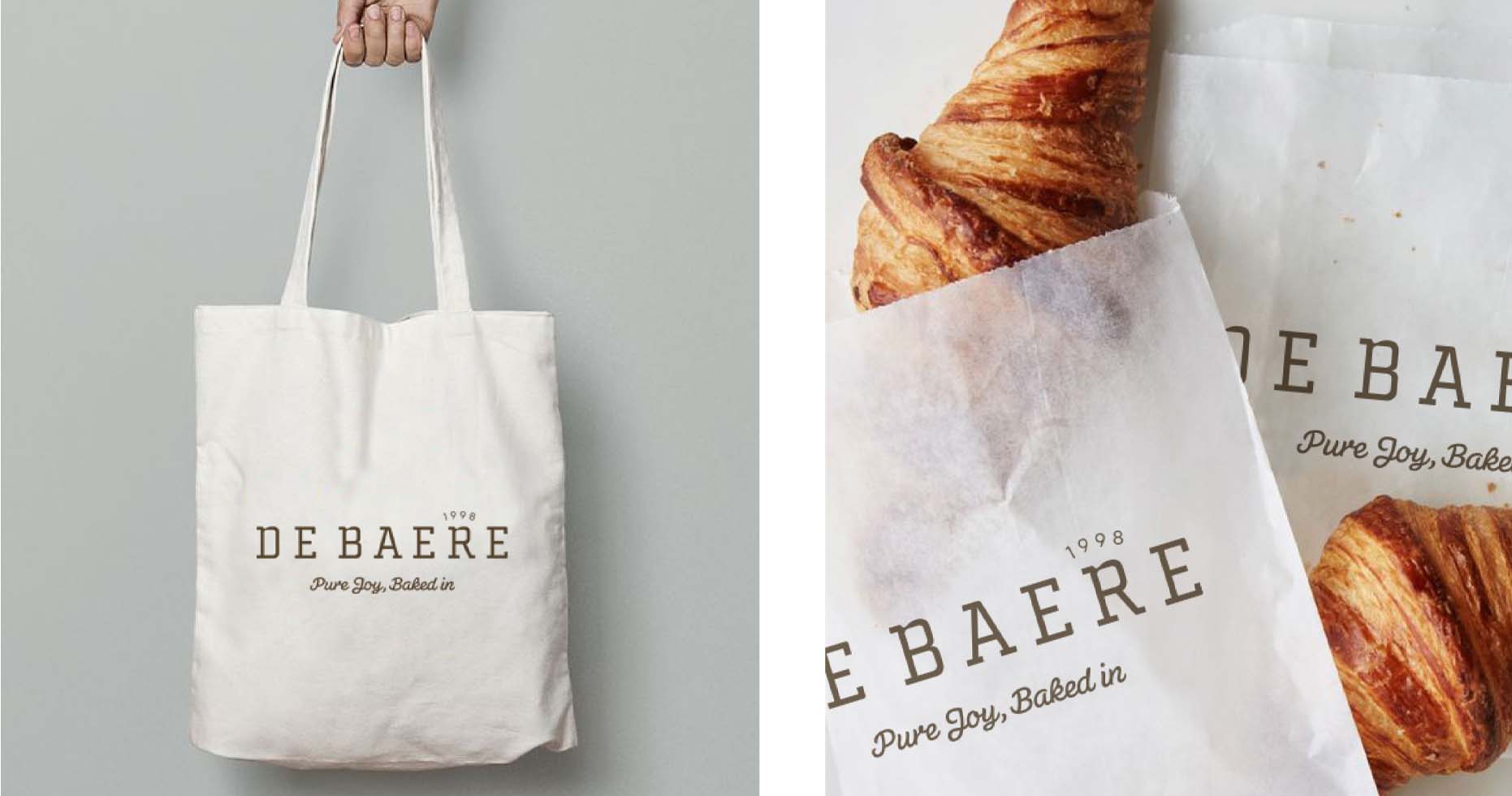
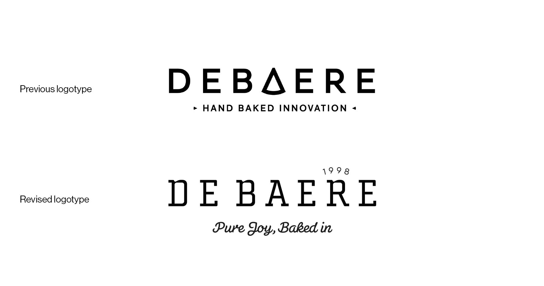
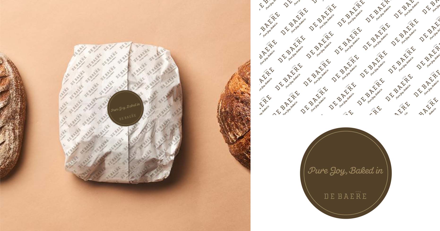
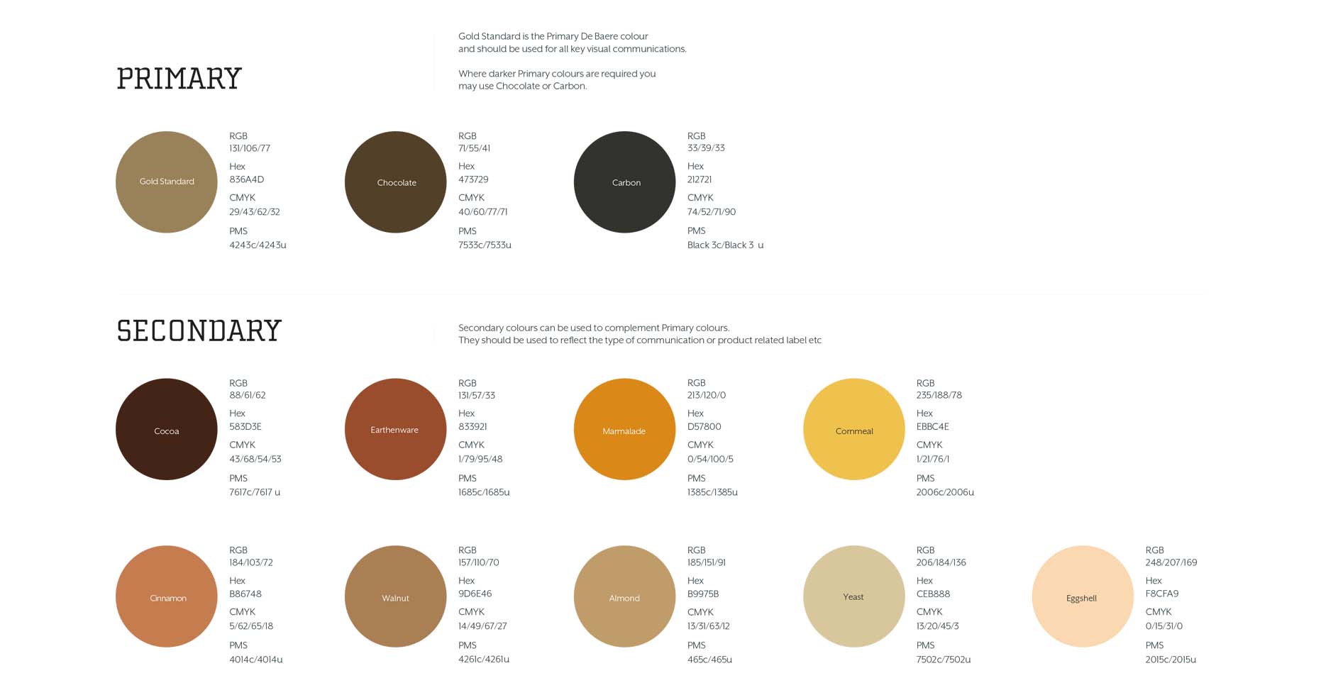
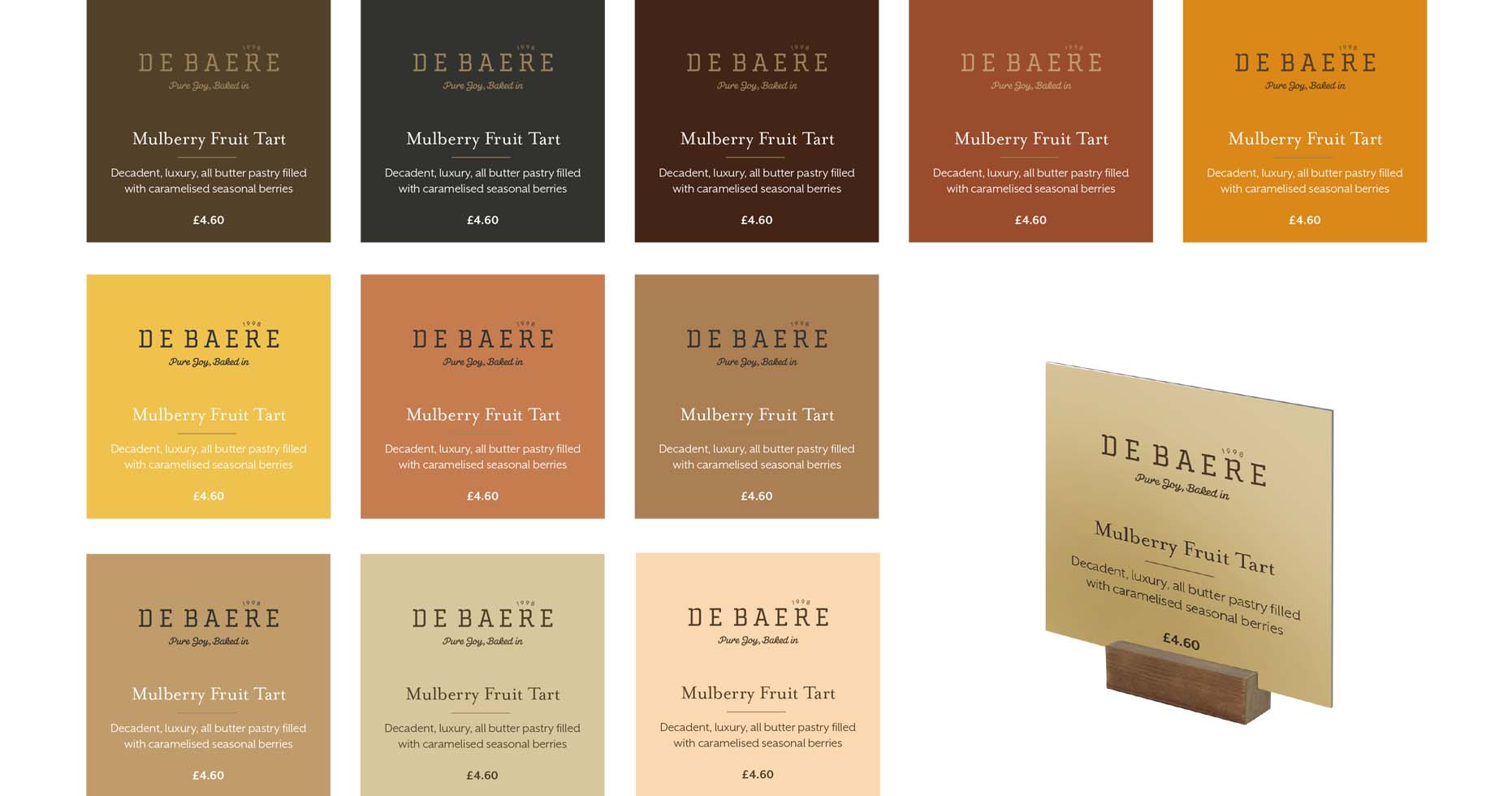
We then began revising the brand identity. Heritage is an important pillar of the brand strategy. It creates trust and suggests excellence over time. Established in 1998, this was added as a suffix to the brand logotype. We redrew the main logotype, imbuing it with more character and history, inspired by the heritage signage that would often adorn small patisseries in the cobbled streets of Belgium. We underpinned the brand marque with a new strapline ‘Pure Joy, Baked-in’ and set the typography in a bespoke font by Hubert Jocham. We also developed a new colour palette, inspired by the ingredients that are part of De Baere’s everyday.
The combination of typography and colour are intended to create an emotional connection with the brand, associating De Baere with the visceral feeling of what it means to do something from the heart, to create something with real value that nourishes the spirit as well as the body, motivated and underpinned by the desire for excellence.