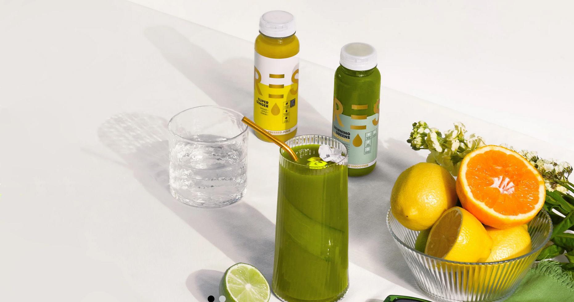
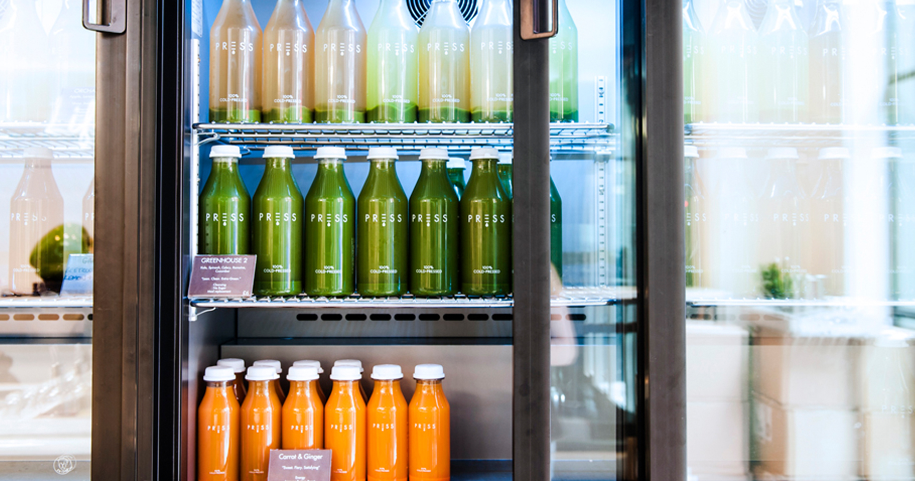
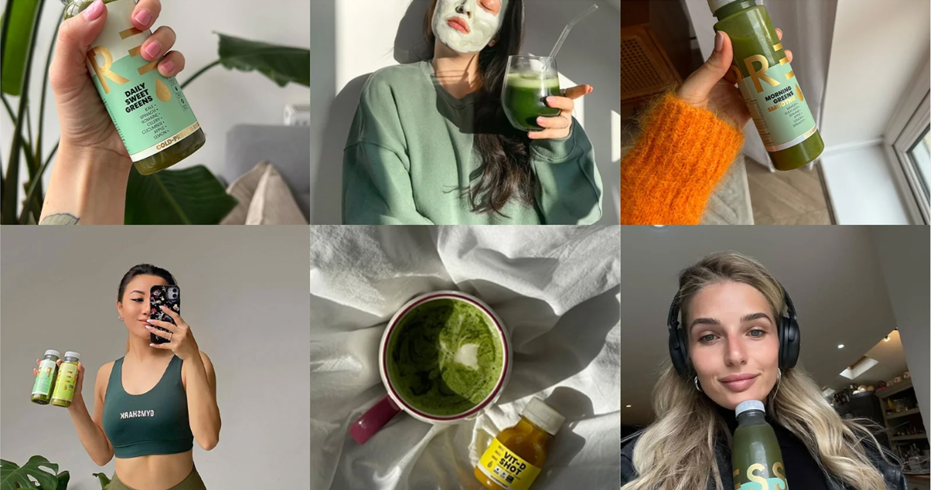
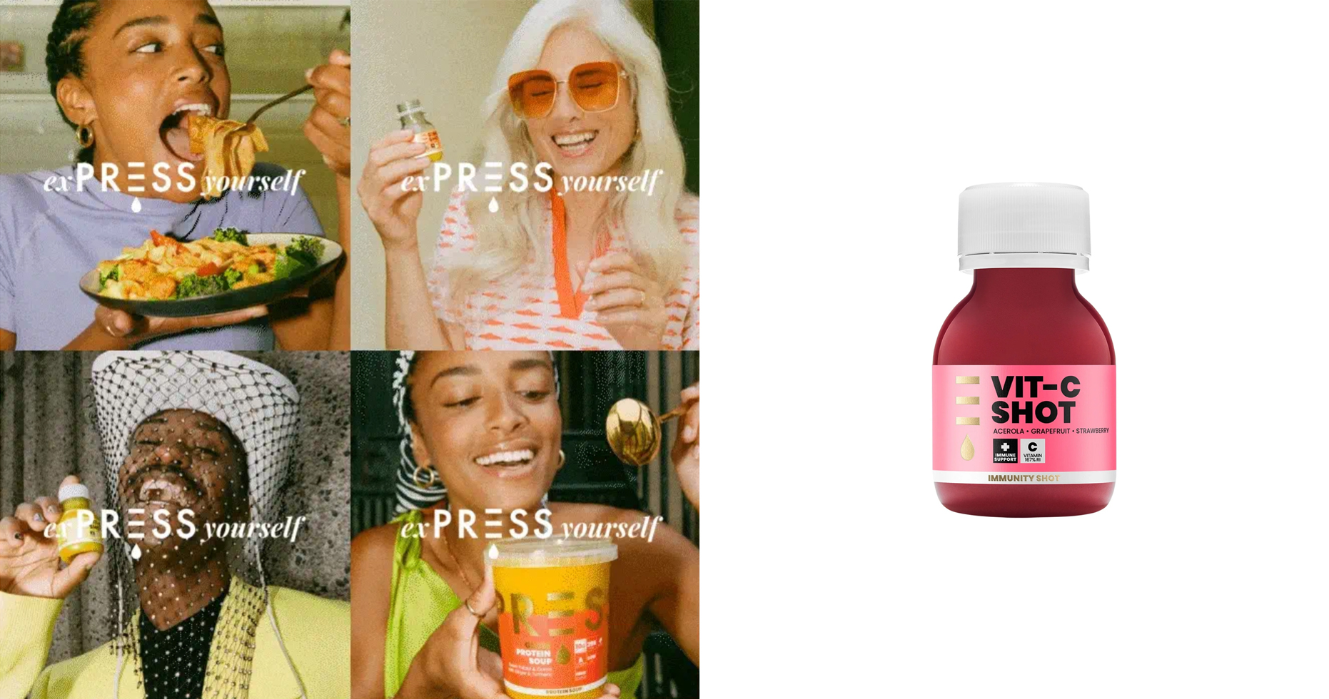
With the mission to be London’s go-to source of organic juice, PRESS provides busy health conscious individuals with just the right balance of naturally extracted fruit and vegetable juices to help form part of their daily health ritual.
Cold Pressing is a technique of extracting juice from fruit and vegetables that retains nutrient content, purity of flavour and quality consistency. This is in strong contrast to traditional juicing techniques of pasteurisation or blending that have a negative effect on nutritional values and flavour. Until recently the term was relatively unknown in the UK. Creating awareness and communicating the benefits was key to the success of the identity.
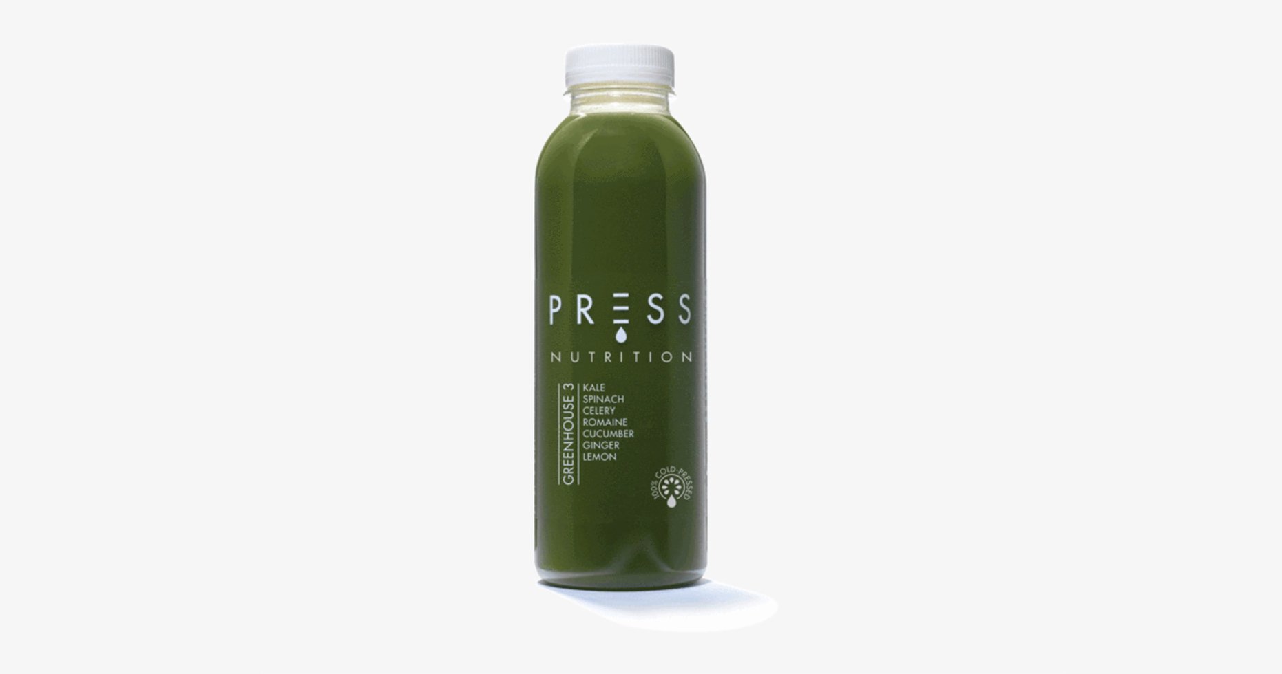
Our work began with verbal identity, creating the name – simply PRESS. Our brand identity communicates both the physical process of the cold-press technique and the premium quality of the product. The neutral colour palette allows the vibrant colours of the juices themselves to be highly visible and not overpowered by the brand. Our work covered; Research – focus groups – insight, Verbal and visual identity – guidelines, Core Proposition, Packaging design, Retail concepts.
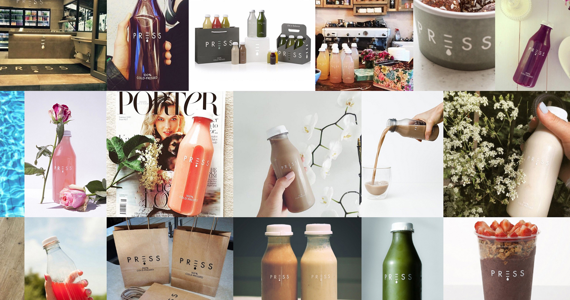
The brand has now reached an even larger audience across the capital with five dedicated stores in the Kings Road, Chelsea, Soho, The City and St Pauls as well as concessions within Selfridges department store and Equinox health and fitness centres. Shortly after launch, the brand raised over £2 million in additional investment funding. In 2021 PRESS partnered with the Soho House group to provide it’s products to their private members club houses. The brand is now stocked by hundreds of retail, hospitality and leisure brands worldwide making it one of the UK’s most successful brand stories in recent years.