

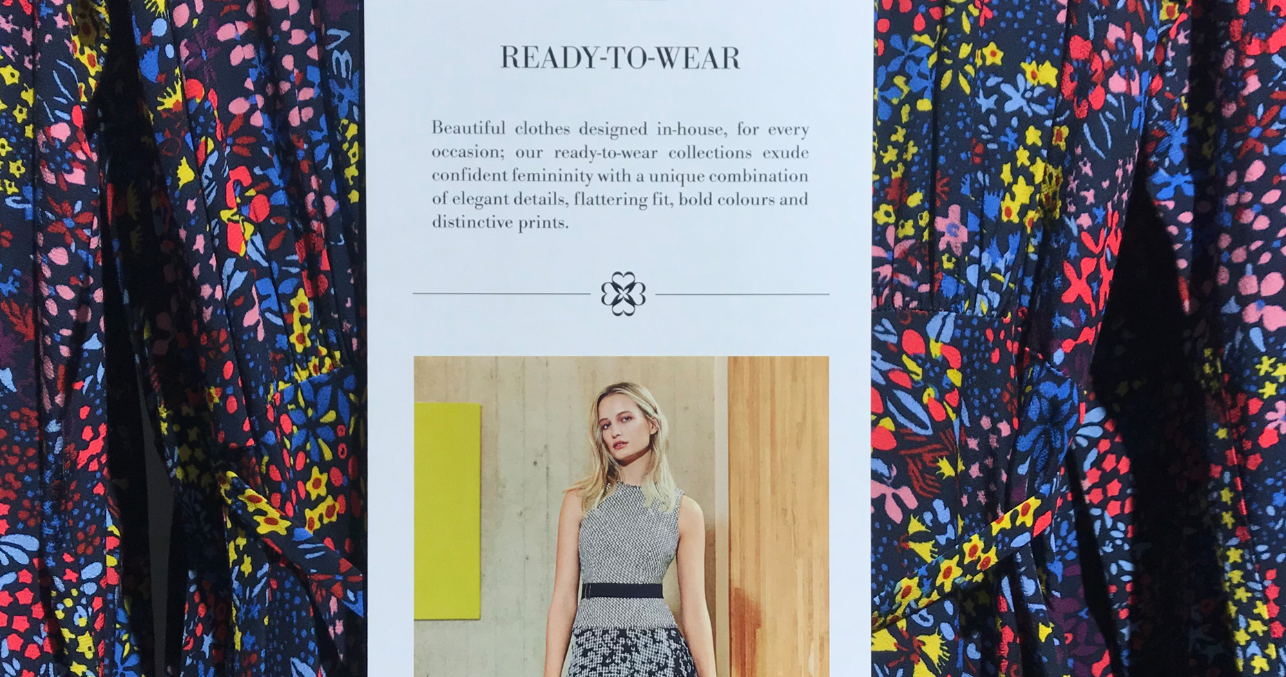
Beloved by sophisticated, feminine and intelligent women alike, L.K.Bennett fast became the go-to place for those who want to look serious but stylish. Upping the glamour quotient for SS12, the new marque clearly illustrates this.
In the late 2000’s the company was bought by investment capital firm, Sirius Equity, it’s new head, previously CEO of Jimmy Choo. He recognised the need to reinvent the brand as an international fashion label and reach a younger audience. The primary internal tactic in achieving this was through a new internal product design team as well as outside collaborations. Following an in-depth examination of the brand’s culture, model, and practice it became apparent that the change in brand positioning should be communicated by an update to the existing identity whilst ensuring their existing core customer did not feel alienated. Intrinsic to the brand overhaul was the creation of a new symbol, an acronym of the brand name.
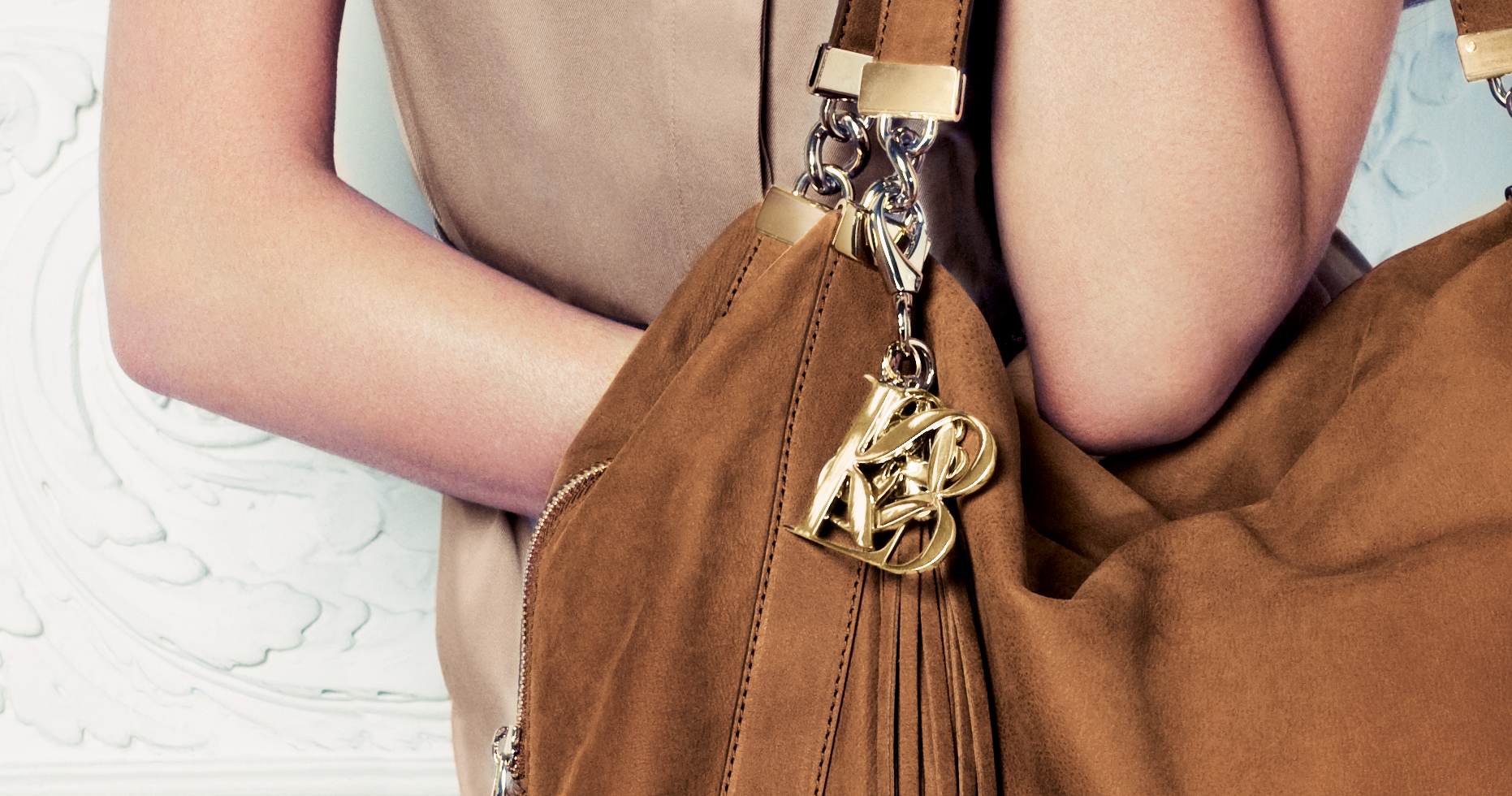
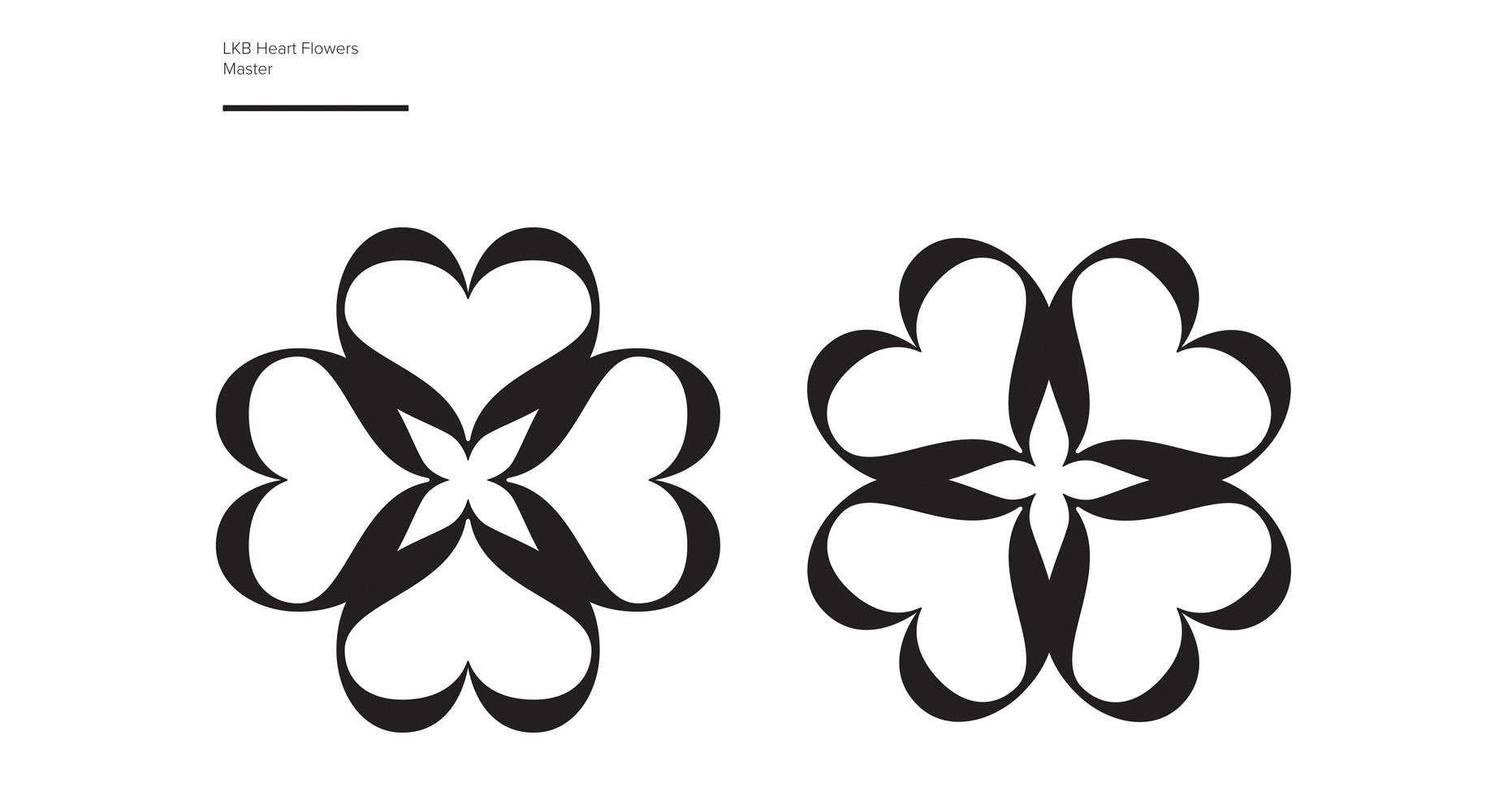
With strong branding credentials, we were the natural choice for such a significant addition to the company’s identity. Jay Flaxman, Creative Director, recalls “One of our early inspirations was black satin ribbons, they have a femininity, fluidity of form and an immediate association with fashion. A stylised black ribbon had appeared alongside the earliest incarnation of the L.K.Bennett logo and they already use ribbons as part of their retail packaging. The action of tying the bow to give a feeling of completeness was also a key idea. We then connected the shape of the letter ‘B’ with a satin bow.” From there, the challenge for our team, working alongside designer Andreas Neophytou, was how to integrate the two angular letterforms of ‘L’ and ‘K’ with the now more fluid ‘B’ in an elegant way.
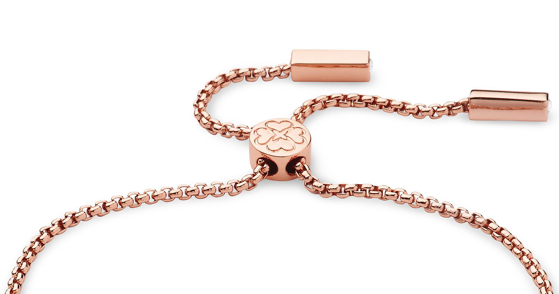
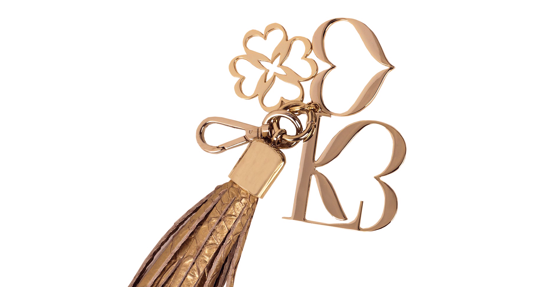
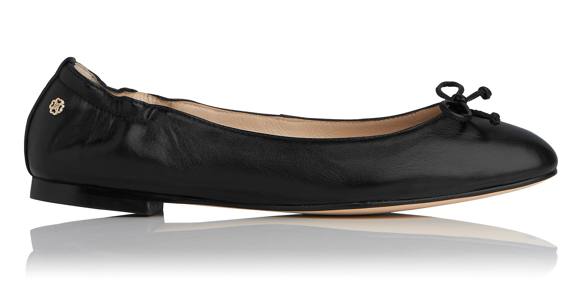
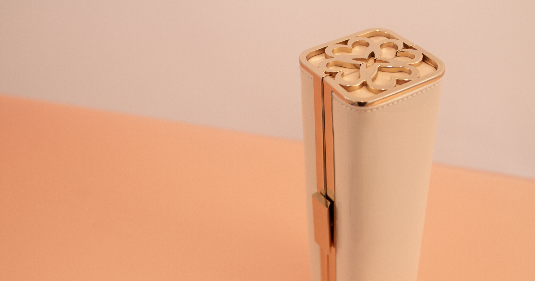
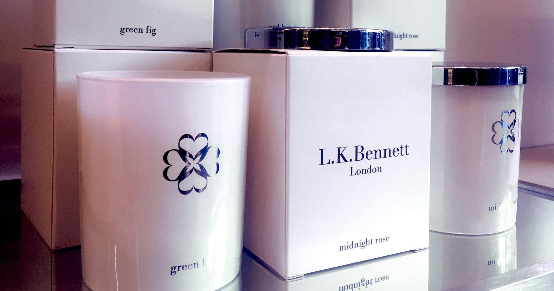
Mindful of the existing L.K.Bennett logotype which used a version of the URW Bodoni typeface, we were careful not to veer too far from this or risk an unhappy pairing with the well known L.K.Bennett logotype. Once the letterforms had been finessed, the three letters flowed into each other almost seamlessly, with even the negative space between the ‘K’ and ‘B’ suggesting a heart shape. We then created an additional device to compliment the new marque by rotating and repeating an element of the design to form an elegant flower-like symbol. the ‘Tudor Rose’. The combination will be used by L.K.Bennett as both an embellishment on the inside of their handbags and as a grip pattern on the sole of a ballet pump. The new marque will first be seen as a set of metal charms adorning a swishing leather tassel on the entire new handbag range and will then follow on their range of shoes and accessories launching AW12.
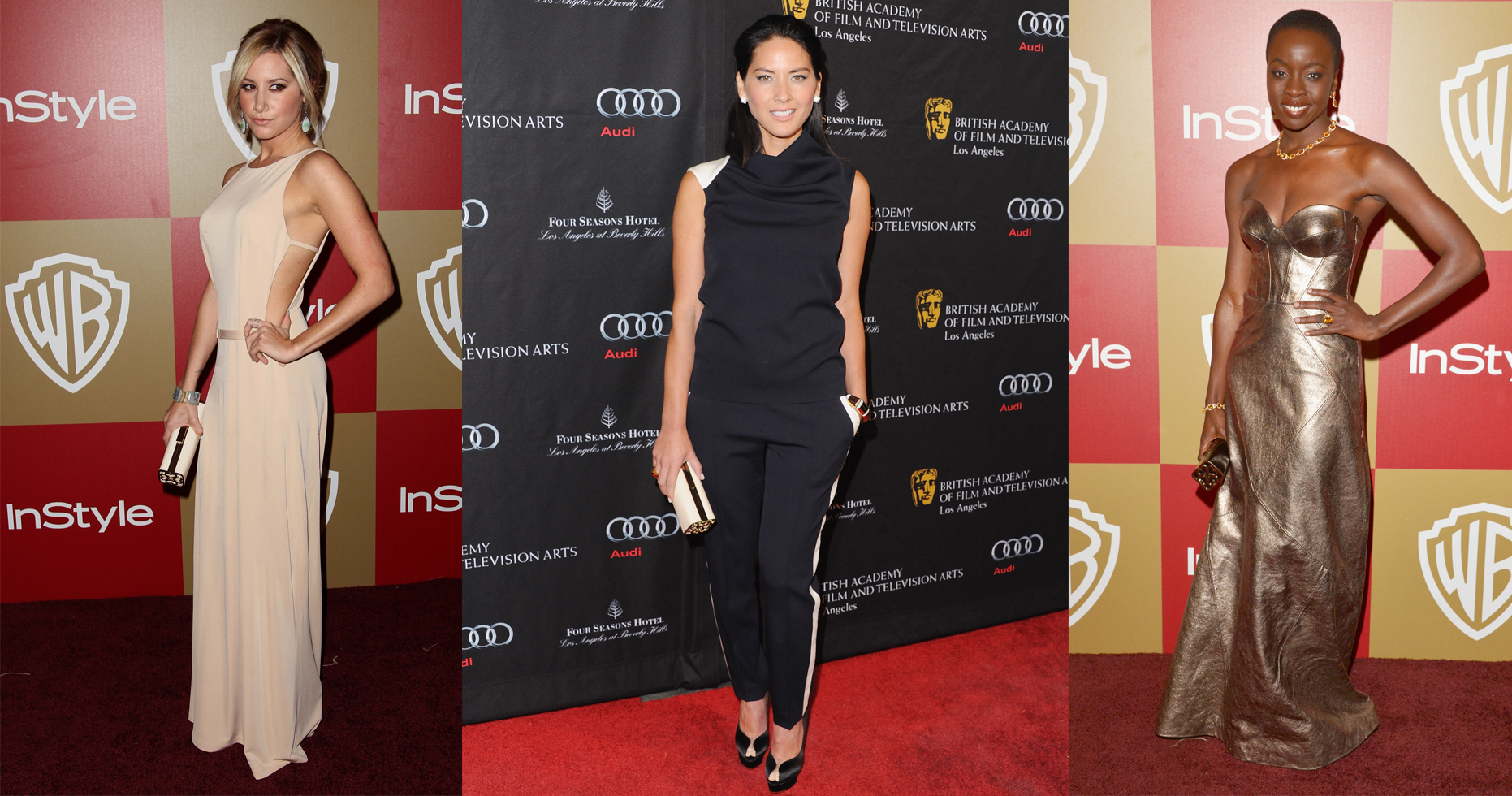
The advertising featured established British actresses, Emily Mortimer and Rosamund Pike in a contemporary, higher fashion context to draw parallels with the new brand positioning.
Over a decade later the product range continues to feature the marques we created to great effect. The company effectively competes against heavier weight fashion labels, enjoys increased loyalty within its existing client base and has earned new found respect within the fashion industry.
Excerpts from this article originally appeared in Design Week, read the article here.